
An international team of researchers has unveiled the ‘Air Quality Stripes,’ visually representing global air pollution trends. While Europe shows notable improvements, Africa and Asia reveal alarming increases, emphasizing the need for global action against air pollution.
A groundbreaking visualization tool named the “Air Quality Stripes” has been developed by an international team of scientists to illustrate global air pollution trends over the decades. This project reveals stark contrasts between significant improvements in air quality across Europe and alarming deteriorations in parts of Africa and central Asia.
“Air pollution is often called the ‘invisible killer,’ but these images make the invisible visible, showing the changes in particulate matter pollution over the decades,” Kirsty Pringle from the EPCC at the University of Edinburgh and co-director of the project, said in a news release.
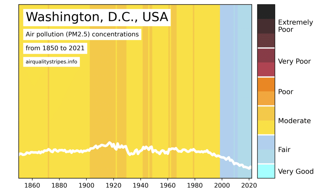
The Air Quality Stripes were inspired by the widely recognized Climate Warming Stripes and developed collaboratively by the University of Leeds, the University of Edinburgh, North Carolina State University and the UK Met Office. Each stripe represents the average annual concentration of particulate matter (PM2.5) — a mix of tiny liquid or solid particles that can deeply affect human health.
“The bottom line is that air pollution is one of the world’s leading risk factors for death, it is thought to contribute to one in 10 deaths globally,” added Jim McQuaid, an associate professor at the University of Leeds. “Our Air Quality Stripes show the huge range in trends and concentrations around the world. The stripes demonstrate that there is still more work to be done to reduce people’s exposure to poor air quality, and in some places a great deal more!”
The visualizations cover capital cities worldwide, in addition to major urban centers in China, India and the United States. Data from computer simulations and satellite observations were combined to assess changes in air pollution since the beginning of the industrial revolution. The color scheme for the stripes was created by analyzing over 200 online images tagged as “air pollution,” culminating in a palette from light blue (clean air) to black (severe pollution).
“Presenting this scientific data as Air Quality Stripes really brings into focus the stark contrast in air quality trends and people’s exposure to poor air quality depending on where they live,” added Steven Turnock, a senior scientist at the UK Met Office.
Health Implications of PM2.5
Particulate matter with a diameter less than a 30th of the width of a human hair can penetrate deep into the lungs and cross into the bloodstream, affecting overall health and increasing the risk of diseases like asthma, cancer, heart disease and even neurodegenerative conditions, such as Alzheimer’s and Parkinson’s.
Despite hopeful trends in some areas, about 99% of the world’s population still lives with PM2.5 concentrations above the World Health Organization’s recommended guideline of 5 micrograms per cubic meter of air.
The researchers hope that the Air Quality Stripes can be a critical tool for policymakers and the general public in understanding and addressing the complex issue of air pollution.
As McQuaid explained, “To me it’s all about that lightbulb moment when someone understands it; that sudden ‘oh yeah now I get it!’”
“The images show that it is possible to reduce air pollution; the air in many cities in Europe is much cleaner now than it was 100 years ago, and this is improving our health. We really hope similar improvements can be achieved across the globe,” added Pringle.